
HomeFarer
Duration
July 2022 - Aug 2022
Project Type
Website
Role
User research, conceptualization, paper and digital wireframing, lo-fi and hi-fi prototyping, usability studies, and iteration of designs.
HomeFarer is a cooking tutorial website designed to provide personalized experiences. The website suggests recipes based on the user's time zone and dietary preferences. Users can also create custom meal plans by saving and organizing their favorite recipes into lists.
The Problem
Many cooking recipe websites are filled with cluttered layouts and irrelevant content, forcing users to endlessly browse through the pages to locate recipes they can feasibly prepare at home.
The Goal
Design a cooking recipe website that prioritizes meeting the specific requirements of its users and presents the information in a clean and organized layout, enabling users to navigate through the site with ease and efficiency.
User Research
According to user research, home cooks often rely on multiple sources, such as YouTube, Pinterest, Instagram, and Google searches, when searching for recipes or seeking inspiration. However, using different sources can make it challenging to revisit a particular recipe. Users also tend to have specific meals, ingredients, or types of cuisine in mind when starting their search and are rarely browsing without any ideas in mind.
By interviewing home cooks around me, I pinned down the following pain points:
-
Experience
A cluttered layout overwhelmed with information confuses the user and increases the drop-off rate. -
Navigation
Since many users have a specific dish in mind before searching for recipes, the search feature must be easily accessible, and the website should have a user-friendly interface for ease of navigation. -
Personalization
Users want to see quality content related to their own needs and ideas.
Take a look at our persona, Yen-Rong, a busy working parent searching for healthy recipes that can be prepared ahead.

Here is a user journey map to understand how Yen Rong’s emotions may change as she tries to complete different tasks on a recipe website.

Wireframing and Prototypes
I started off by creating a site map that outlines the website's basic structure and the features/sections to be incorporated.

Once the preliminary website structure was planned out, different layout options were explored to determine the most efficient way to organize content. The primary challenge was to determine the ideal amount and presentation of text and images on the homepage for potential users.

As I iterated on my designs, I also took into account how the user experience would translate to a smaller, mobile screen.

Digital Wireframes

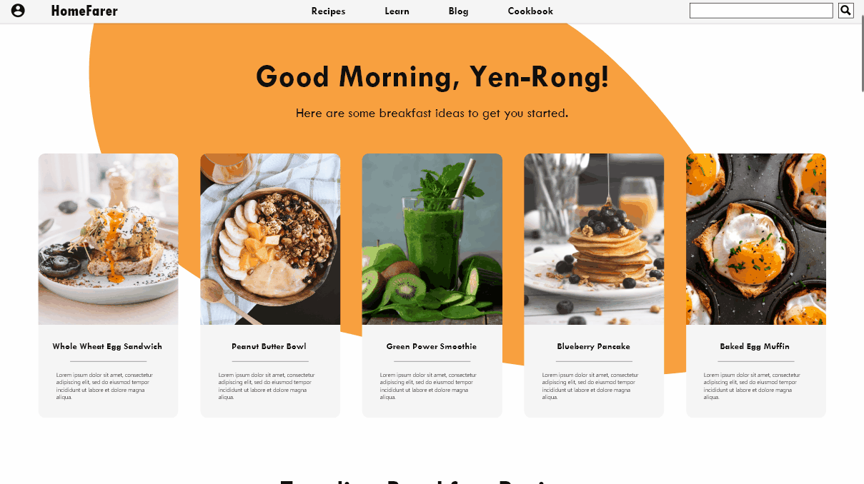
By creating digital wireframes, I gained a better understanding of how users would interact with the page. I made sure to prioritize key features such as the Navigation and Search Bar, which were placed at the top of the page for easy access. Additionally, I incorporated personalized content to enhance user engagement and streamline the browsing experience. Greetings were also included to establish a sense of rapport with the user.

The cooking instruction page has been designed to make relevant information such as recipe name, preparation time, ingredients, and videos easily accessible to users. Additionally, buttons for bookmarking, printing, and sharing have been included for those who want to save or share the recipe.
With low-fidelity prototype finished, it is ready for the first round of usability testing. The tests were conducted remotely, asking participants to complete a series of tasks regarding the core features of the website and submitting user feedback, and the following were observed:
-
Users expect confirmations or response after completing an action.
-
There is a lack of indication for clickable elements.
Refining the Design
According to the insight that users need confirmation after completing an action, a confirmation message is added after user bookmarked a recipe.

Another insight from the usability study is that users thought the clickable elements were not clearly indicated, therefore colors and borders were added to encourage interaction with the elements.

High-Fidelity Mockup

Home Page Demo
Save Recipes Demo
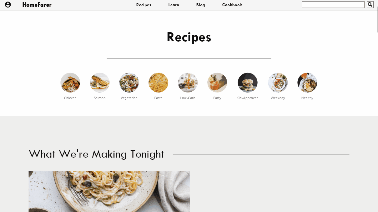
Recipes Page

Search Demo

Takeaways & Next Steps
As I collected data from usability testing and reflected on the user research findings, I became aware of the common expectations users have when interacting with interfaces. For example, users often expect to be able to return to the home page by clicking on the website logo. I believe utilizing this sense of familiarity can greatly influence user behavior and am eager to explore this further.
The next steps to take:
-
Conduct usability studies on the high-fidelity prototype.
-
Improving and modifying features and layouts based on feedback and further studies.
-
Continue to work on other features of this website, such as bookmarks and lists.